The Spice of Life: A Look into #DataChain Challenge #1

Spice of Life
When Brittany Fong reached out on Twitter to start “Dear Data 3” or “Data Chain,” I was surprised and delighted. I’ve followed Andy Kriebel and Jeff Shaffer‘s “Dear Data 2” and attended their presentation this year at the Tableau conference. You see, I’ve labelled myself as a “Tableau Artist,” but perhaps that’s been a bit of a misnomer…until now. The artist hat is square on my head (or perhaps it’s a beret), the midnight madness has begun, and the paint is ready. Yes, ma, we got data to paint!
The process I’ve selected is the one Andy espouses. I create the data, toss it in Tableau because that’s where data goes, and I go to town. Then, like Emril, I kick it up a notch and bust out the paint, because THIS GETS MESSY.

Now, the point of this project, for me, is to push traditional boundaries. I’m not making bar charts to save the world or spare analysts from the perils of chart junk: no, I’m rolling up my sleeves and playing like a toddler in the kitchen. There are no rules except that there are no rules. Sorry, ma, data artist is going to be an “artiste”.
Artists use inspiration from other artists, even when they push the boundaries. Claude Monet had Eugène Delacroix, and I’m following Kelly Martin. Kelly talks about stealing and nodding, but I’m not sure that even cuts it here. When I was interpreting, we’d try each others’ interpreting styles on for awhile to see what stuck and what didn’t, but you could always trace it back to its origin. Now, Kelly is like Emril or Julia Child or whomever is just rocking it in the kitchen these days. My toddler self just wants a piece of the cake and to lick the spoon.

I’m on the left. SPOON, PLEASE!
Our topic this round was ingredients. I decided to take a look at the base of all human cooking: spices. It’s what defines cooking as from a region and illustrates the personal nature of the palate. It’s direct-to-mouth insight into the world toddler-style and responses vary from visceral resentment to love; to heaven to outright hell. Some people love ghost pepper; others would rather dance on a bed of overturned nails than eat the stuff (ask my better half about last night’s atomic broccoli and where I fall is clear). So, one late night call later, I had my data and a plan – err, recipe, rather. Mark my words, dial-a-chef will be a thing.

What, what? The data, the data!
I defined all the spices, and spices within blends, and gave them attributes, such as sweet, hot, and savory. This was not a chemist’s lab – I tasted where needed and went off general impressions with Dial-a-Chef expert, Trina Arnett. I popped my data in Excel, and my Excel data in the VitaMix. Or maybe that was Tableau. Either way, I pureed the stuff and the soup was excellent!

I started with looking at my data literally: I went to my spice rack again, shot some colors, and made sure I went into this with a nice few palettes of color. I then played around, asked questions, made some ugly dashboards (it happens), and bounced ideas off people. Midnight madness hit, and I found my way (mostly). My toddler self kept asking questions, including if others wanted to play. You kids know who you are: you’re truly the ★best★ and saved my hide here. After several edits, The Spice of Life was born. Get your pans ready, as it’s toddler yelling time: THANK YOU MATT CLEMENTS FOR THIS ROCKING TITLE!
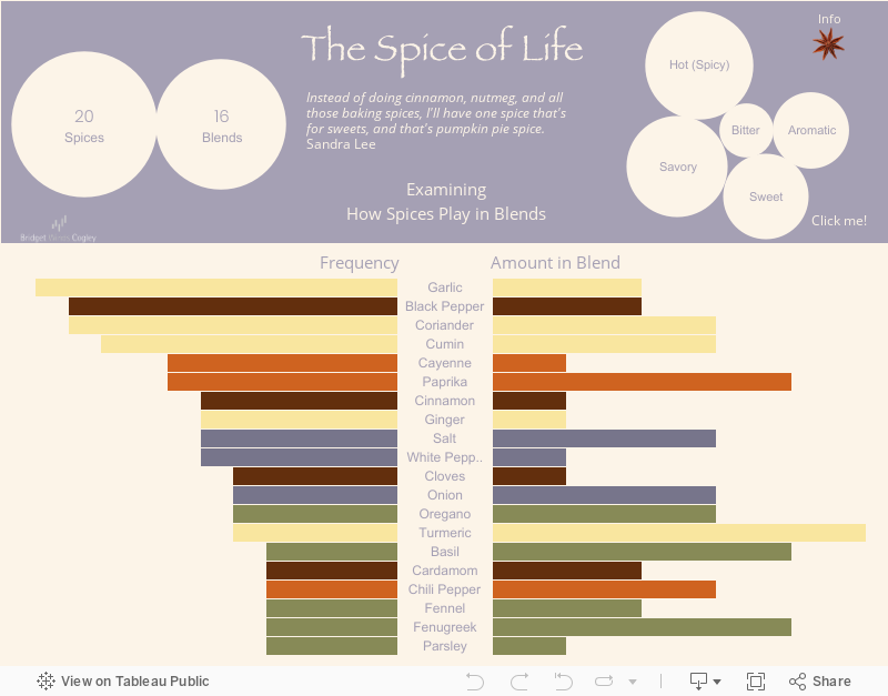
The whole point of this viz was for me to begin to understand how the experts (mainly Whole Foods) decided what spices went with what, so I looked at all my pre-made spice blends. Fellow cooking toddlers: “pumpkin pie spice” is a blend, not a spice from pumpkins or pie. Until a few months ago, I never owned coriander, despite it having such a huge role in my cooking. Who knew?
The art part of this entailed paint and, quite literally, the spices themselves. I’m a big fan of mixed mediums and this was the perfect excuse. Burhan, I hope you don’t have allergies.
[Want to see the photo? Check back next week.]
Things I’ve learned:
- Holy smoked salt, I got to data better!
- The greats weren’t great because at birth they could paint; The greats were great cause they paint a lot! (Language warning – it’s Macklemore.)
- Follow the recipe. Really, follow the recipe…


The tone is witty, hooking the reader from the word go. Embellished with personal details and pictures, it does not bore you for a second, building up excitement for more …
The visualization and underlying analysis depict a “personal” spin on the world of spices, instead of using established measures ” Scoville scale” or else, the author uses a personal scale to evaluate the spices. Colors and symbols used in the visualization, such as one for info, go well with the topic of spices.
Thank you so much for your kind words!
[…] blog, what else would I say? Photoshop?) I’m really trying to push this year in dashboard design. That’s my focus. It’s not a New Year’s Resolution, because I started in […]
A really enjoyable post, Bridget. I’m in the process of finishing up my first Data Chain assignment…it was both harder and more fun than I expected. 🙂
Thanks Michael! Definitely agree with you on both counts. Looking forward to seeing the postcard. Cheers!
A very entertaining post, Bridget. I’m in the process of finishing up my first Data Chain assignment – it’s definitely harder and more fun than I expected it to be. 🙂